Bending the Third Rail
Because We Should, We Can, We Do
Cost of the War in Iraq
(JavaScript Error)
Monday, March 05, 2007
Deflated Inflation
Tim at "The Mess That Greenspan Made" has a couple of charts up today that give a great example of just how funky government reporting of inflation really is.
First, let's have a look at what has been happening to the prices of television sets:
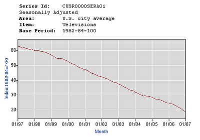 Wow! That's cool! Prices are falling and good times are here!
But wait a minute, then there's this chart of the cost of admission to movies, concerts and theatre's:
 Oops.
Oops.
Well.
That is up a bit, but when you take the two and average them out ... voila' .... no inflation!
First, let's have a look at what has been happening to the prices of television sets:
 Wow! That's cool! Prices are falling and good times are here!
But wait a minute, then there's this chart of the cost of admission to movies, concerts and theatre's:
 Oops.
Oops. Well.
That is up a bit, but when you take the two and average them out ... voila' .... no inflation!
0 Comments:
About Me
- Name: Greyhair
- Location: Wine Country, California
I'm a very lucky person with every allergy known to man but still happy to be enjoying a wonderful life living in the best place in the world!
Blogroll
The Big PictureBillmon
Blah3.com
Born at the Crest of Empire
Eric Alterman
Eschaton
FireDogLake
Feingold's Blog
Dan Froomkin
The Huffington Post
Hullabaloo
The Illustrated Daily Scribble
Jesus General
Juan Cole
Matilda's Advice and Rants
Mia Culpa
MsJan Quilts
Needlenose
The Oil Drum
Political Animal
Political Wire
Spooks of the Ozarks
Talk About Corruption
TalkLeft
Think Progress
War and Peace
The Washington Note
Other Resources