Bending the Third Rail
Because We Should, We Can, We Do
Cost of the War in Iraq
(JavaScript Error)
Sunday, June 11, 2006
Chart of the Week
Here's a handy dandy historical chart, adjusted for inflation, of the stock market (S&P 500) from The Big Picture (click to enlarge):
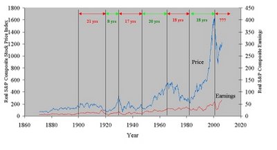 The red periods are stretches of "bear" markets and the green are stretches of "bull" markets.
Why put this up you say?
To illustrate how the conventional "buy and hold" strategy of most financial advisors is stupid. Suppose you did your investing for retirement starting in, oh, say 1965. So the early 90's roll around and you want to retire. How have those stock investments done?
This chart also starkly shows just how inflated, by historical standards, stock prices really are. From what I read, I'm guessing we're in a brief (3-5 yr. cyclical bull market) market upswing that is a part of a longer term (5-20 yr secular bear market) market downturn that began in 2001. If so, this is a very poor time to remain invested in the stock market on a "buy and hold" basis. You can clearly identify the "cycles" that occur within a larger market trend. This is what is meant by "cyclical" vs. "secular".
Of course, I'm not a market professional. But I'm suggesting that if you are investing in the stock market, take the time to learn about the dynamics involved. Don't just rely on a brokerage house representative who has a big vested interest in perpetuating the "buy and hold" strategy.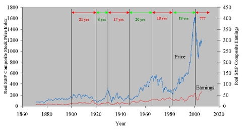
1 Comments:
About Me
- Name: Greyhair
- Location: Wine Country, California
I'm a very lucky person with every allergy known to man but still happy to be enjoying a wonderful life living in the best place in the world!
Blogroll
The Big PictureBillmon
Blah3.com
Born at the Crest of Empire
Eric Alterman
Eschaton
FireDogLake
Feingold's Blog
Dan Froomkin
The Huffington Post
Hullabaloo
The Illustrated Daily Scribble
Jesus General
Juan Cole
Matilda's Advice and Rants
Mia Culpa
MsJan Quilts
Needlenose
The Oil Drum
Political Animal
Political Wire
Spooks of the Ozarks
Talk About Corruption
TalkLeft
Think Progress
War and Peace
The Washington Note
Other Resources
Even if I had money to invest, I wouldn't. I was paying attention to the lessons that Ken Lay, Jeff Skilling, Bernie Ebbers, Dennis Koslowski, etc. taught.